A Bedroom Turned Blooming Bathroom
You guys!!! It’s time for another MAJOR major renovation reveal!
Last month, we gave you a tour of the dramatic kitchen transformation, and this month it’s all about the master bathroom. This one was our trickiest yet…. seeing as how there wasn’t even a master suite to start with. We ended up taking a spare bedroom because these clients did not need a third guest bedroom, along with the old main bathroom, and turning it into the master suite of alllll our dreams!
Are you ready to see how we took a bedroom and turned it into a blooming bathroom?!?
First things first, here’s what we started with….
Can you even believe?
We didn’t need the entire bedroom to create the bathroom, but the wall separating the soon-to-be bathroom from the other bedroom couldn’t exactly move wherever we wanted it to. Load bearing walls are pretty full of themselves like that. We didn’t let it stop us though.
The architect figured out how far we could move the wall without the roof caving in and then we started scheming. At this point, it might be important to mention that that was AFTER he had the entire space laid out and we were like, “Errrrm….What if we don’t do what YOU designed and we do what WE designed instead?” Awwwkward. Thankfully he was cool with our toe stomping and this is what happened…..TA-DAH!!!
Turns out we created my very own dream bath, except in the WRONG house….Whoops!
I guess it was bound to happen because a) the client’s taste and mine are extremely similar and b) while working on this project we were still light years away from working on our own bathroom, so I figure my ideas have to have somewhere to go, right?
I’m incredibly grateful that this vision came to life even if it’s my not mine. I can always pretend it’s my bathroom. After all, mine will come together soon enough! Probably once we’re done making my office look like the Temple of Athena.
Besides, major transformations are completely satisfying and fulfilling to witness no matter who they are for.
Also…Can we all just take a moment to admire these eeeeeevil ball and claw feet??
Whoever designed this tub over at Kohler wasn’t playing around. Now that I’ve laid my eyes on this evil Queen of a tub I look at my own like “Psh. Not impressed.” It just doesn’t even compare. The Kohler is not only elegant and fear inducing, it’s actual cast iron, which means it will require Thor to carry it into the house. It’s totally worth all the grunting and cursing that will come from the installer because it will retain heat longer than the lighter-weight, not-delivered-by Thor, acrylic versions.
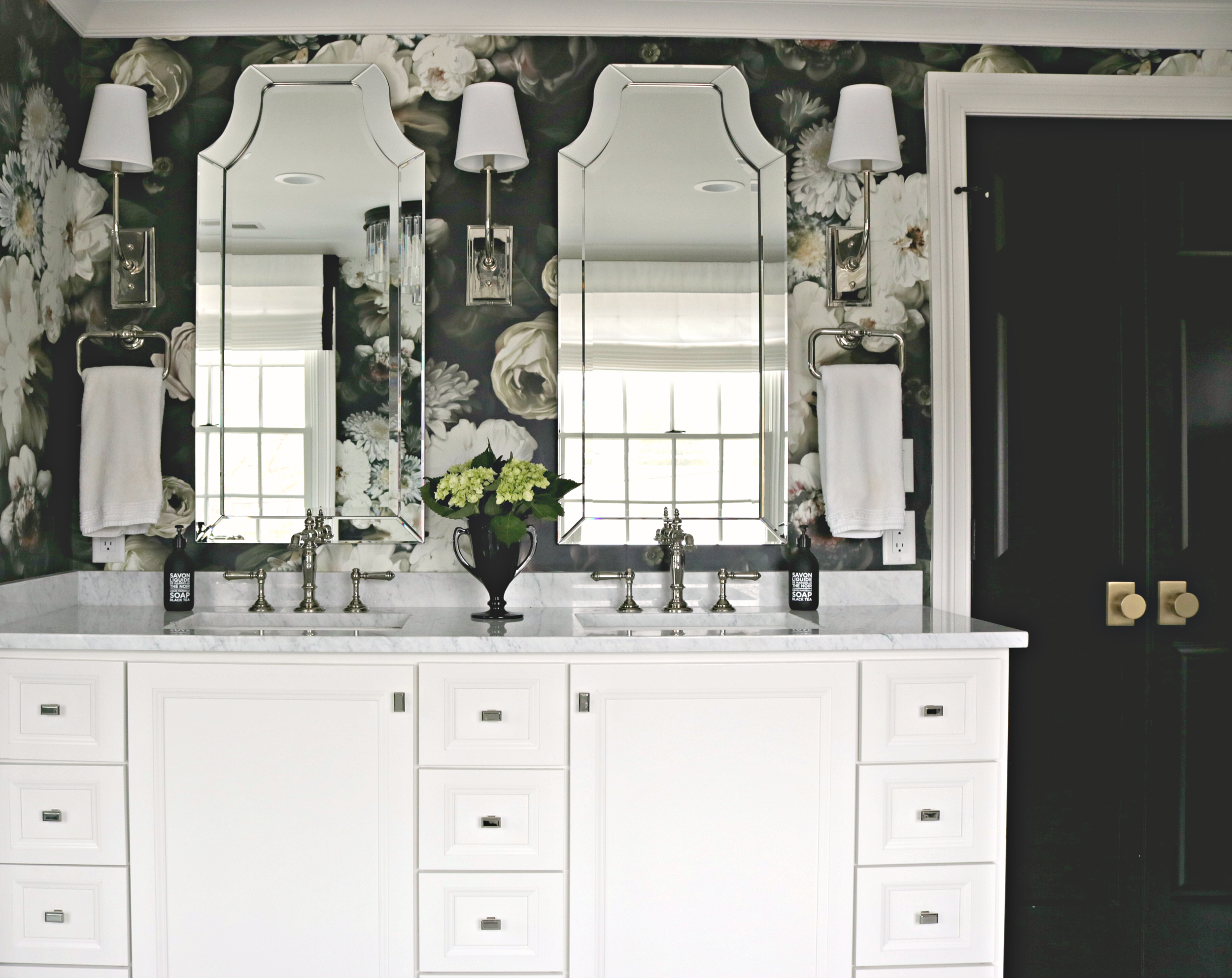
When deciding on the layout, we were tempted to squeeze the vanities between the windows in order to provide a “His” and “Hers” but then realized that it was best to have one, wider vanity, across from the windows to take advantage of the natural light.
We designed the vanity with ample storage to fit snugly between the shower wall and the door leading off of the master bedroom. Since we were limited on space for a door swing and couldn’t use a pocked door with all the plumbing within the vanity wall, we ended up going with French doors. Hardly a compromise if you ask me!
DESIGNER TIP: Finishes do NOT need to match. Note the mix of polished nickel hardware, faucet, and lighting with the brass doorknobs. Mixing finishes is a great way to show your personal style and to showcase different features. Those French doors wouldn’t look the same with nickel hardware. Besides, why should a girl ever have to decide between two fabulous things? Have both! Real style never follows the rules.
When it came to utilizing an empty corner we were not about covering up those gorgeous blooms! We decided an open etegere was the perfect solution for stacking up some towels and displaying some coveted decor.
The beauty in using a bold wallpaper like Ellie Cashman’s Dark Floral is that the abundance of flowers means there’s no need for wall art and a bunch of accessories. I find when I have the pleasure of visiting this space that being completely surrounded by flowers and not a lot of stuff is very calming. So calming that I ordered some of the same wallpaper for our office in the hopes that it will keep my mind settled and my eyes satisfied.
I like to think that when our visual sense is fulfilled, like when we’re on vacation in a beautiful place, that maybe our other senses are calmed and less needy. Isn’t that what luxury really is? Calm and comfortable with happy senses.
There’s nothing like the classic combination of marble and polished nickel to add a historical feel within a brand new space. The Kohler Artifacts line is where it’s at for adding timeless elegance. The fact that we get to see the faucets twice within the mirror reflection is no accident.
Designer Tip: When placing a mirror, consider what design element you want to see twice. If the reflection is of something that you don’t even want to see once, you’ll be extra unhappy when you have to see it twice. Make sure when hanging large mirrors that you are reflecting something that you love to look at!
Soooo, what do you think? Are you moving in too?!?


