KDI Rules For Kitchen Design
We don’t share our designer secrets very often, so when we do, it’s because we’re on a mission! And because we love you guys! As a thank you for being such loyal and engaged followers, we’re sharing a few of our pro tips and kitchen design rules and regulations.* Just in case you’re planning a kitchen renovation or building a spectacular new home.
What’s this mission of ours, you ask? To STOP the boring emptiness that is new construction and to slow “updating” renovation cycles by creating classic, ageless designs via timeless materials, mixed styles and finishes, and loads of detail!
We all know that true, timeless beauty, is always in style, and we know what the formula is to create it!!
Hint: it’s NOT through materials that promise perfection. Like, at all.
Perfection = BORING
* By “Rules and Regulations” we’re only partially serious because we all know rules are meant to be broken!
Are you ready for our first ever, let it be written, kitchen design rule???
KITCHEN DESIGN RULE NO. 1: NO sink in the island
We know…
Hear us out.
Islands are the #1 clutter magnet in the house.
And clutter magnet #2? You guessed it- the sink.
Do not combine their powers!!!
You should especially heed our warning if you have babies, toddlers, or more than two people living in your house… The sink island crap magnet will overpower your entire world and you’ll be buried alive by air drying bottles and sippy cups!
Even if your world isn’t filled with princess and super hero plastic cups, it could be the non-stick pans and cookie sheets that get you. There’s ALWAYS something in the sink…We don’t allow those somethings to be the center of attention.
Another thing is, your island is probably one of the first things you see in the morning and unless you’re extremely tidy and have only extremely tidy people living with you (as if), the clutter will manifest out of thin air and attack you first thing! Let’s not have your day start with overwhelming clutter.
We DO have exceptions to our rule. I mean, of course we do, seeing as how we’ve broken it ourselves multiple times!
You can consider having a sink in your island if your household meets one or more of the the following criteria:
No kids
No husbands
Extreme tidiness
No other option
In this kitchen, we opted to place the sink in the island for a few reasons. These clients met the above criteria by being very neat and also kid-free. Additionally, placing the sink in the island positions it towards the wall of windows, with a great view of the water.
If your kitchen has a window, we often place the sink underneath it so that you can look outside and at least pretend that you’re at peace with doing the dishes.
Now, if you absolutely must have your sink in the island, here’s Design Tip #1:
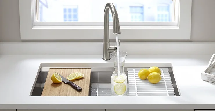
Consider a multi-purpose sink. It’s a super smart decision, no matter where your sink is placed!
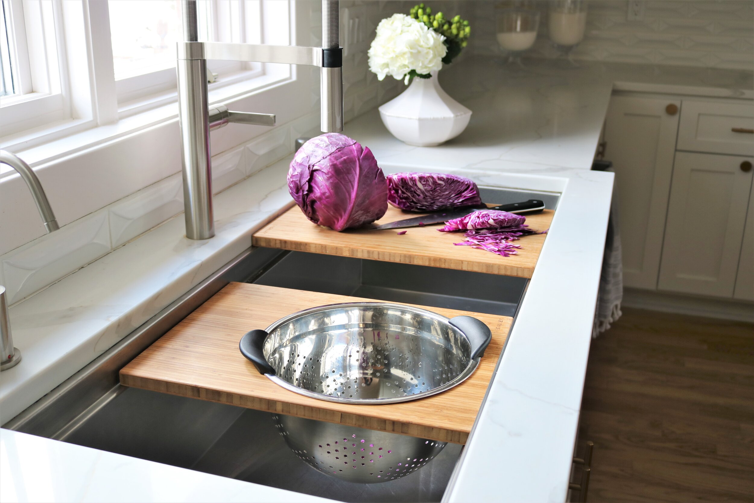
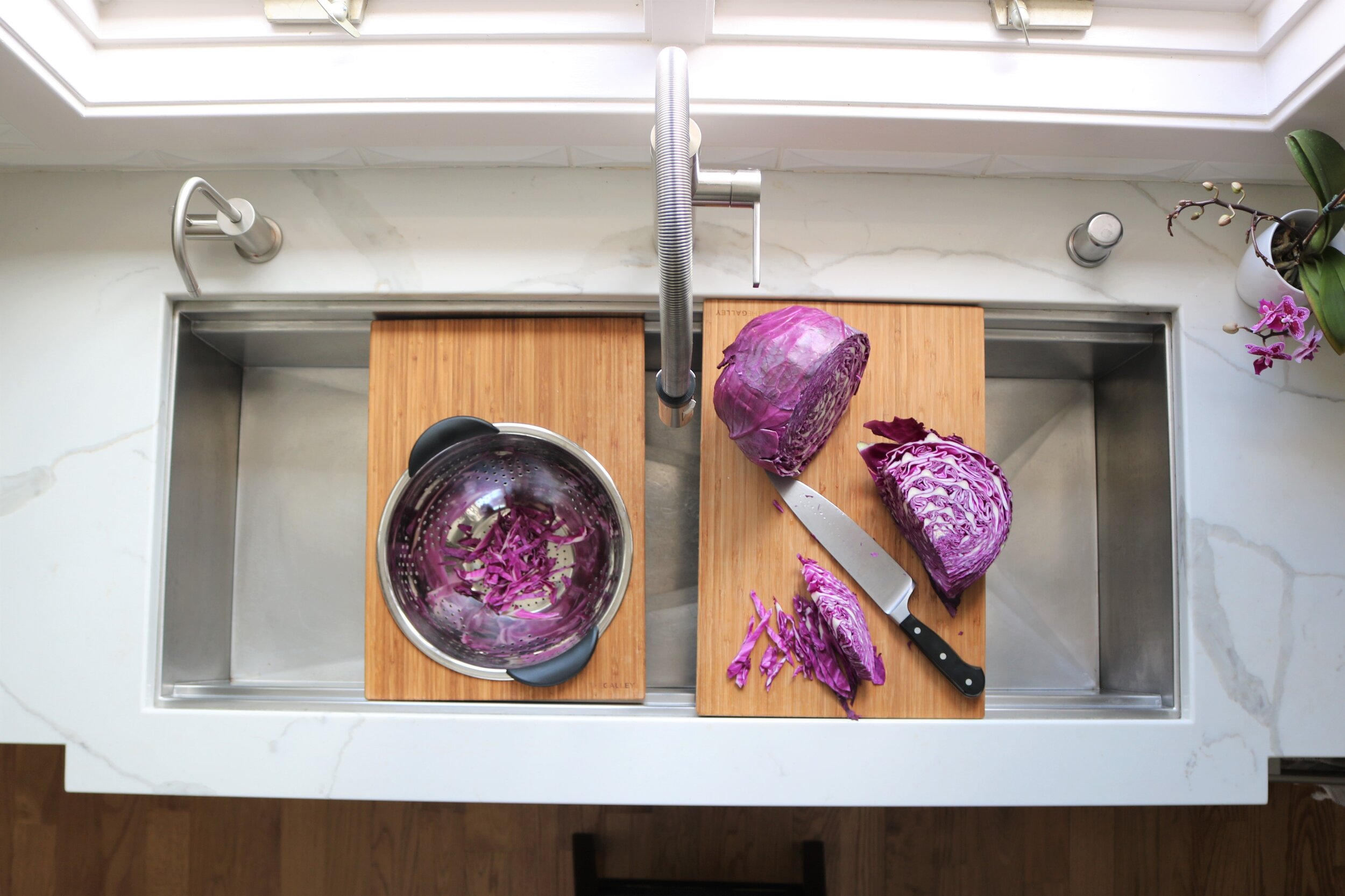
Multi-purpose sinks come with integrated accessories that make life easier and more beautiful by reducing countertop clutter by placing functional accessories like drying racks, dishpans, and cutting boards INSIDE the sink! These super smart accessories sit on little ledges within the sink walls and never have to block or sit directly on top of the drain.
Speaking of setting things directly on top of the drain….
Police Officer #1: “Woah. I wonder what that poor guy did.”
Police Officer #2: “Hmmm…If I had to guess, he probably put a plate on top of the drain.”
Police Officer #1: “Sounds about right. Had one last week that left a pan soaking on top of the drain…..Couldn’t even identify the body.”
THAT IS HOW ANNOYING BLOCKING THE DRAIN IS.
These sinks make it practically impossible to block the drain.
Multi-purpose sinks = There won’t be a Criminal Minds episode based on your life.
Our top choice: The Kohler Prolific
It’s loaded with smart accessories and a great price! Divorce Rating: 0%
I decided early on in our building process that the Prolific was the sink for me so when the budget kept saying “No.” I said, “Be quiet. This is happening.” and I’m glad I stuck to my guns. Worth. Every. Single. Penny!
Our second Runner Up: The Kallista Multiere by Mick De Guilio
It’s completely gorgeous AND functional. The wood grain on the cutting board is a little more elegant than the bamboo cutting board that comes with the Prolific, but this sink doesn’t come with as many accessories as the Prolific. The price range is around $3000 making it a love it or leave it sink.
Divorce rating is 10% on this one. However, it’s functionality could save just as many marriages.
Now, for our BIGGEST, baddest, most custom, multi-purpose sink choice:
The Galley
SWOON!
The Galley is sold by the foot, which means you can have a sink that is 17 feet long. Just kidding….wait…. 17 feet might actually be possible. The Galley, as you can see, has thee most accessory options on this planet and the price is…. Wellllll, what price? It’s one of those luxury items where “if you’re concerned, it’s not for you.”
It’s ok. We’re crying with you!
P.S. The Galley also comes in an “L” shape so that it can turn corners….As if we weren’t completely spoiled with the 900 other options!
Divorce rate on this one is at about 40% if both parties are not in complete agreement. It all depends if the the ice bucket is locked and loaded with beer.
See? The Galley even makes fake-prepping food that no one is going to eat ‘cause it’s just for a photo look fun!
KITCHEN DESIGN RULE NO. 2: Don’t be too cabinet-y.
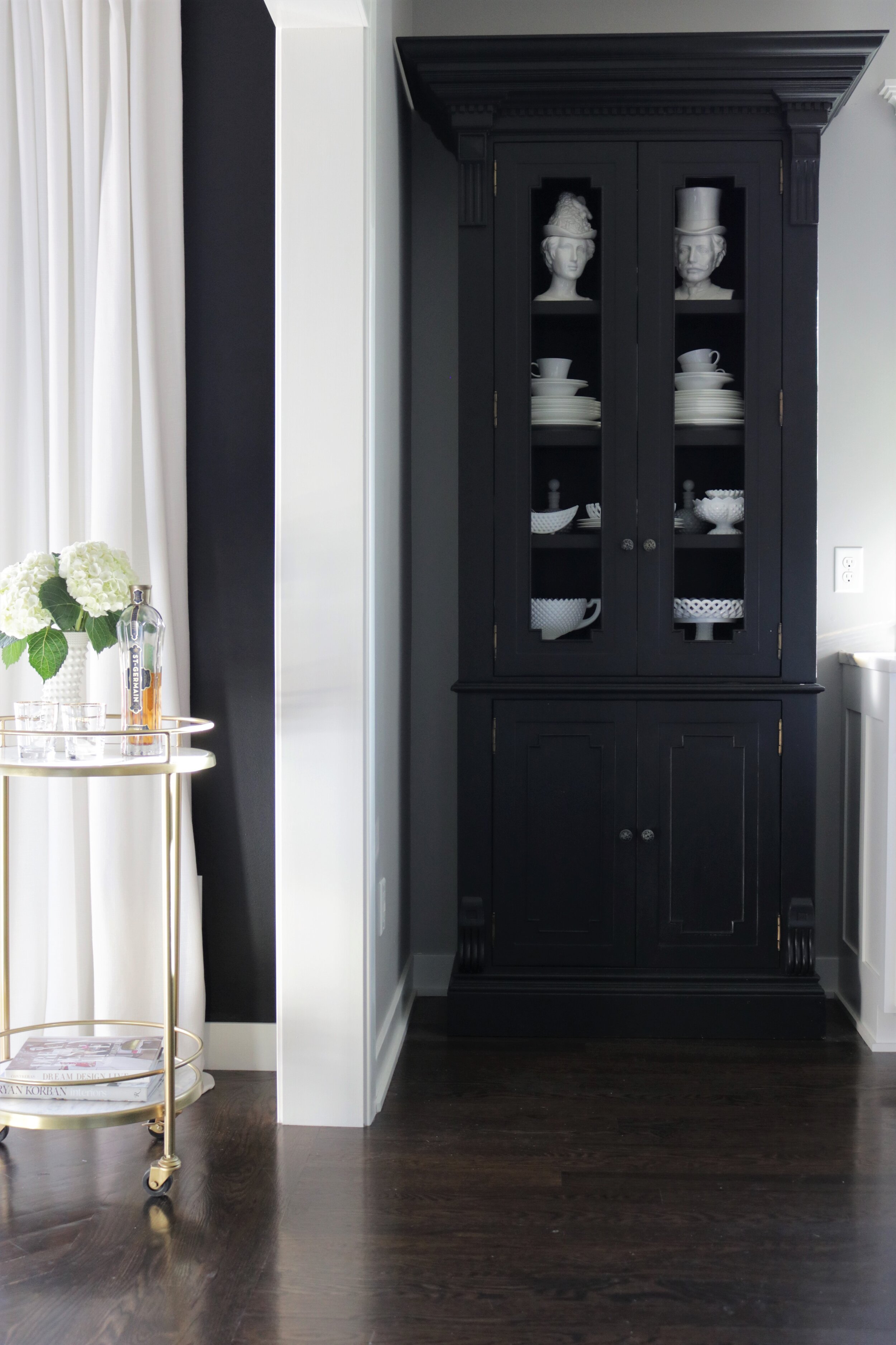
Having only cabinets in your kitchen is kinda boring and basic looking. Incorporate some furniture or cabinets that look like furniture in at least one area.
An all cabinet look will feel “function only” no matter how many accessories you add to the counter. Furniture adds depth, warmth, and somehow, even a sense of history. If new construction homes feel too sterile to you, this is one great way to add some substance!
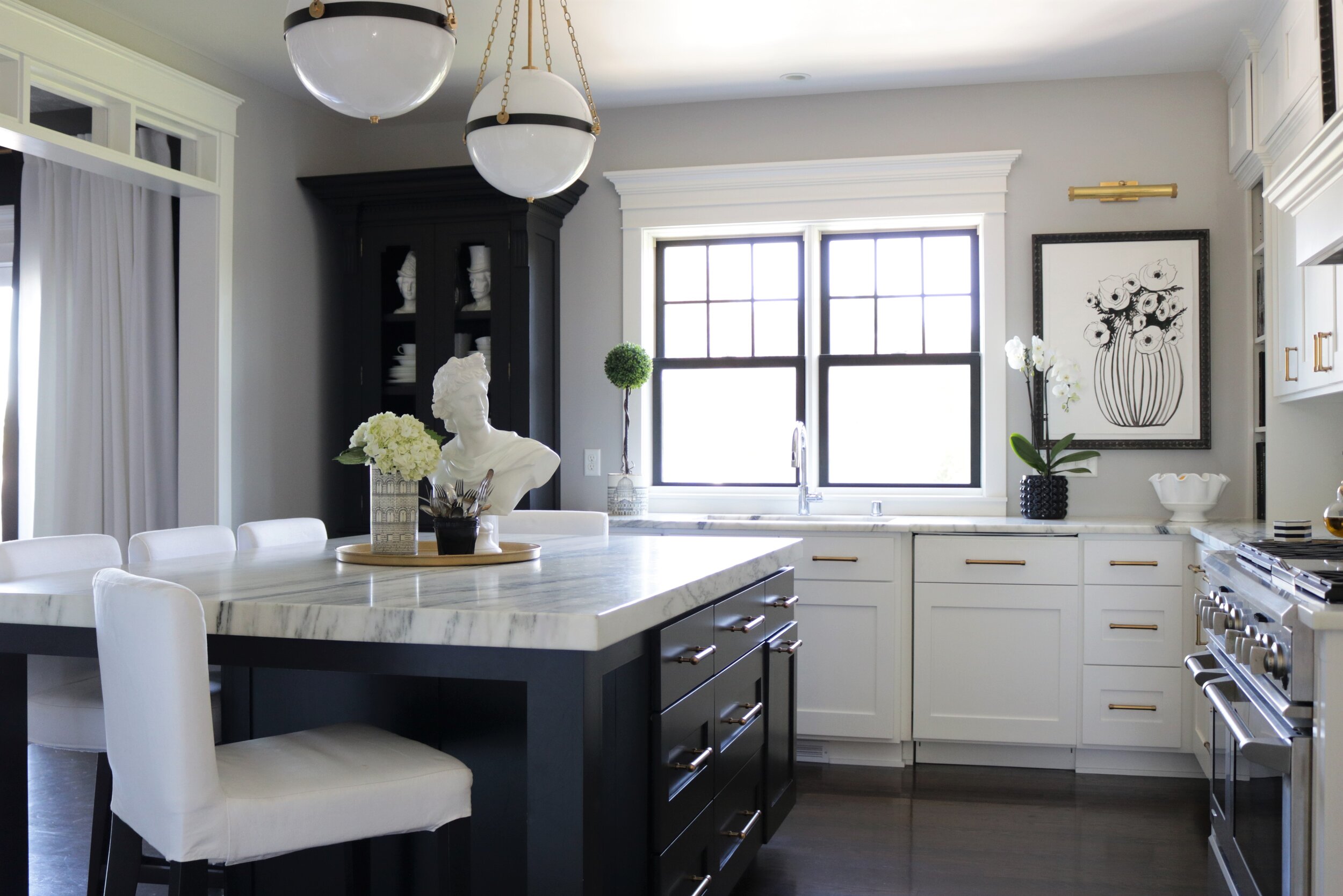
This freestanding cabinet is infinitely more interesting than just another bank of uppers and lowers.
Cutting down on the amount of base cabinets also means cutting down on the amount of countertop material needed, so incorporating furniture-style pieces can even save you money.
Designer Tip #2: Make some of your cabinetry look like furniture pieces. Here’s how:
Add a furniture base instead of going with the normal toe kick. We love the elegance a simple detail like this can bring!
Change up the color or finish in one area. We do this by changing up the hardware on accent pieces or finishing the inside of a glass cabinet a contrasting color or stain.
Go floor to ceiling with stacked cabinets to create a more historical look (and also storage for crap you only bring out once a year.)
Add tall glass doors to a taller cabinet so that it stands out more. Most of the time we actually prefer to leave these types of cabinets without lighting for the interior because most actual hutches and china cabinets are not lit and the added light can feel harsh and commercial. We avoid glass shelves for this same reason. This leads us to Design Tip #3…If you want light to be able to shine down through the shelves in order to illuminate glassware or china, you can still use wooden shelving. The trick is having the shelf made more like a picture frame with glass in the center. That way it looks like wood from the front, but light can shine through the center! Win-win!
KITCHEN DESIGN RULE NO. 3: Close up the ends!
Nothing looks more kitchen-y than an open end to a run of cabinets.
If you can manage to close off the end of each cabinet run by having the last cabinet go down to the counter or have the run end with a floor to ceiling cabinet, you’ll not only help reduce visual clutter as you look into your kitchen from surrounding spaces, but you’ll also avoid the ever annoying exposed backsplash edge.
I broke my own Rule Number 3 here:
But that was to incorporate furniture, (as in Rule Number 2) so they cancel each other out. Plus, there won’t be tile here, so no tile edge to worry about. However, I wouldn’t put it past me to decide on tiling the entire wall some day...
KITCHEN DESIGN RULE NO. 4: Save the bar height counters for an actual bar.
Counters at counter height or table height are always the most functional and the most comfortable.
End of story.
KITCHEN DESIGN RULE NO. 5: Don’t match all the finishes!
There’s nothing more builder-grade than matching all the finishes. Besides, it’s fun to mix things up! The added bonus is that you won’t have to worry about finishes going out of style. You know how in the 80s and 90s, all hardware and faucets were shiny brass? And how a couple years ago, Pinterest was filled with tutorials on how to spray paint it all to update it? And then approximately 8 seconds after the spray paint dried, brass came back “in”? Granted, it’s not back in the same way, but it just goes to show that if you have too much of one finish throughout, you’ll constantly feel like you need to update.
A collected look can never be pinpointed to a certain era which means the look of your kitchen will be ageless! When the trends change, you’ll be in the clear!
Spoiler Alert: Classic doesn’t always mean white cabinets either. I mean, we will forever love white cabinets, but if you’ve had a favorite color your entire life then that color IS a classic for you. Why not use it in a big way?
In this kitchen, we mixed matte black with satin brass and polished nickel.
The bottom line is this: The kitchen is the heart of the home, and any space in which you spend the majority of your time should be comfortable, beautiful, and inspiring. If our surroundings aren’t helping to lift us up and support our dreams, what ARE they doing???
If you’re planning a kitchen renovation or building a new home and would like some help from professionals that have seen the worst of kitchen nightmares, please feel free to drop us line!
kelledameinteriors@gmail.com.
We love talking kitchen design and helping people create their ideal place for people to gather and enjoy the most special times of their lives!
i.e. kitchens that are not future crime scenes.


